Going Out on A Limb
I realize it’s taken me forever to give you final pictures of our master bathroom and I apologize! Pavlo and I have attempted to tackle 3 projects at once and it leaves little time for blogging. At any rate, all but one measly thing is finished in the bathroom and I’m waiting anxiously for it to arrive. I decided to try something different when it comes to the wall art in this bathroom. It could either turn out wonderfully or it could be another slight disaster like the master bedroom (refer to the last blog post on how we had to fix that minor mishap!)
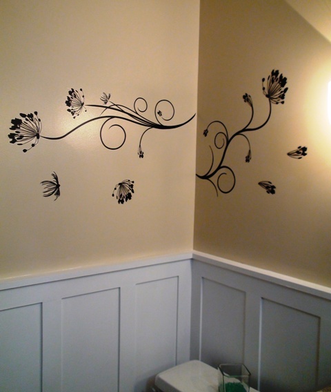
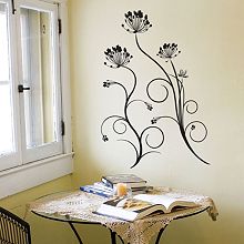
You see, there’s this designer on HGTV named Sarah Richardson who does amazing (and amazingly expensive) renovations and in an episode of one of her shows she used wall decals on just one wall of a bathroom. I’ve seen decals used in other shows and in magazines and always blew them off as cheap, boring and a little tacky. However, Sarah proved me wrong! The way she used just a small amount of decal in this bathroom proved to me that they weren’t so awful when used properly and in moderation! In fact, I thought it was a brilliant way to dress up a bare wall without overwhelming the space so I thought I would experiment with that same concept on a wall in our master bathroom (the wall next to the toilet to be more specific). Here is a picture of the wall decals I ordered and am sitting by my kitchen window waiting for:

I know that some of you are wondering what the heck I was thinking and honestly, I often look at this picture and think the exact same thing. Like I said, this could either turn out great or turn out to be a big waste of time and money!
The great thing about wall decals is that they are basically stickers that you put on your walls and peel off (if need be) with absolutely no damage to the wall itself. You also have great flexibility in how you use the design. Given that this is my first time working with them I’m really hoping both of these things turn out to be true. You will of course find out immediately if they do, or even if they don’t. Anyways, my vision is to use more of the “swirls” in this design and fewer of the “flowers” to merely fill a blank wall space without making it overwhelming. I debated on the black color for a while and then decided since my mirrors and accents in the bathroom were black it should be just fine.
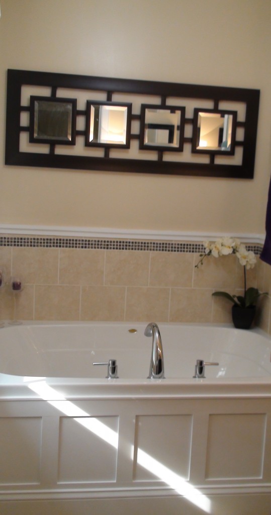
Here are a couple of pictures of the rest of the bathroom completed. You’ll just have to anxiously wait for the post on how these decals work out. Hey, it’s only fair since I’ve been waiting anxiously for them to arrive!

