Tweaking the Mudroom Layout
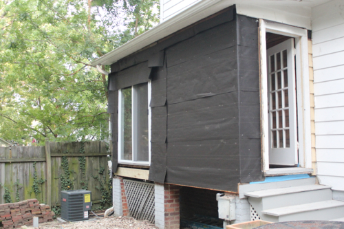
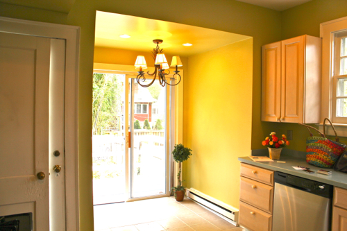
After completing the framing, sheathing, moving the exterior door and installing tar paper to our new mudroom addition, we were close to being done with it’s basic layout…but not quite. Up to this point the new space was looking pretty darn good from the outside:

However, inside there was still some work to do. As soon as you stepped into the mudroom, coming from the outside, the space felt just a little claustrophobic. Since the room is quite small, it was as if you were slammed by the opposing wall as soon as you walked in. This is pretty much all you saw as soon as you walked in:
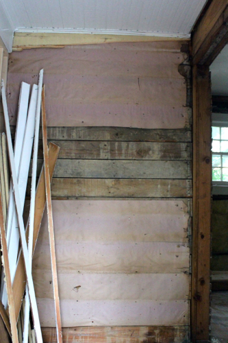
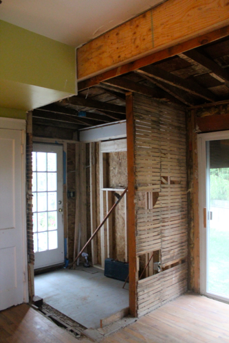
To remedy this we decided to shorten this wall which divided the new mudroom from the old eat-in kitchen area. Just to help clarify we decided to remove about 18 inches of this wall (see picture below). That’s the old eat-in area on the right side of the image, the new mudroom on the left side and this picture is taken from the vantage point of the main kitchen space.
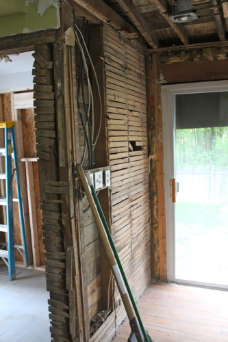
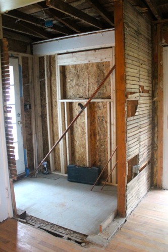
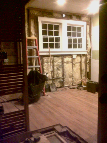
So, without further adieu, that portion of the wall was removed and here’s what we are left with:
It looks so much better when you walk in too; so much more open!
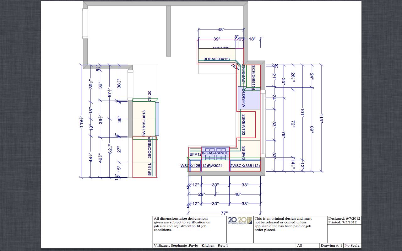
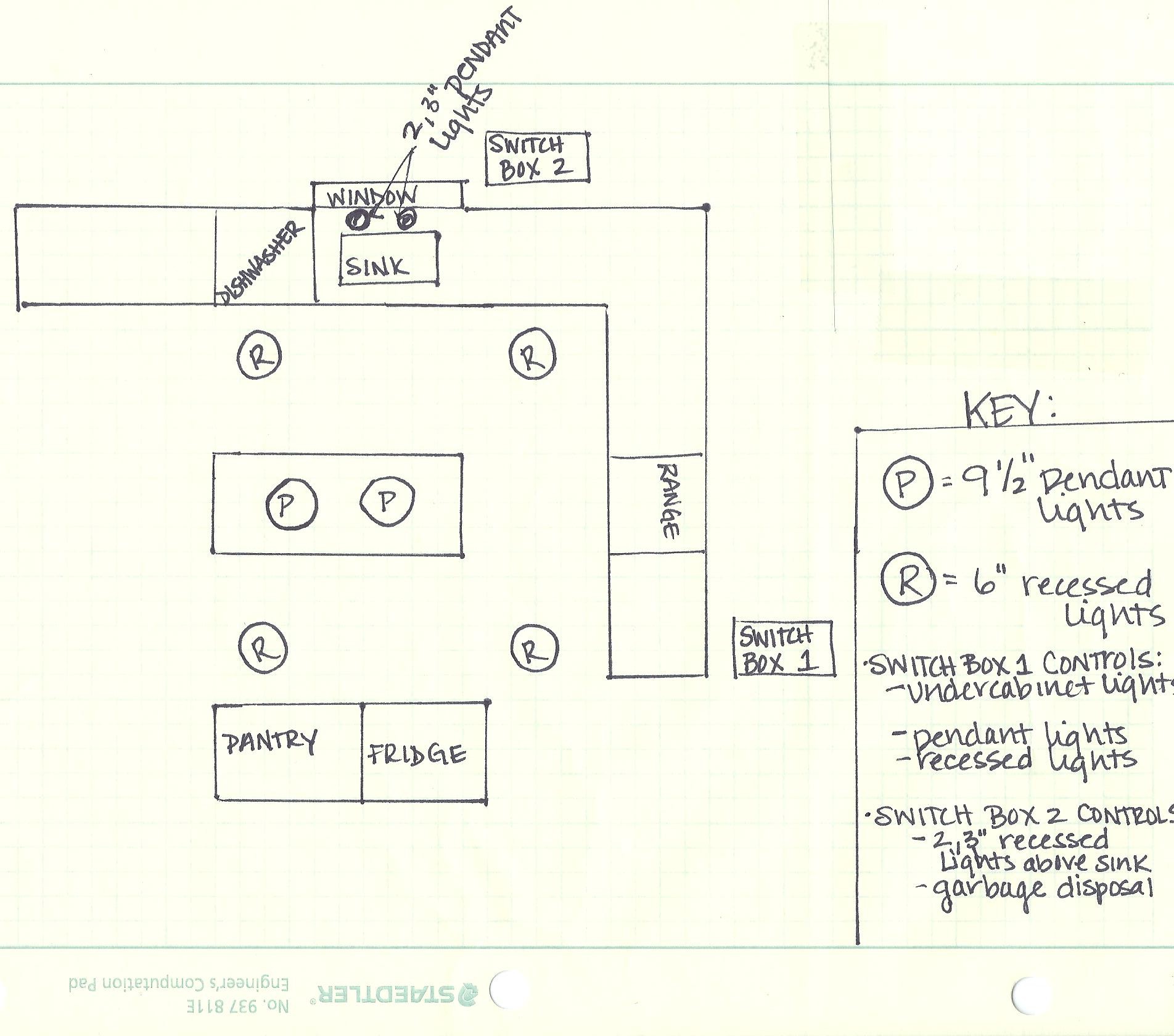
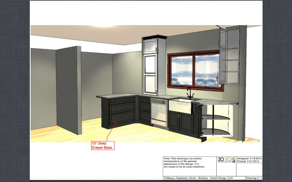
This is also far better for the kitchen’s new layout. As you can see in the rendering below we are going to have a peninsula on that side of the kitchen so by shortening this wall we now have more walking space around the peninsula. The wall I’m referring to is on the left side of the rendering running perpendicular to the back wall and to the new peninsula.
I’ll be back soon to post on our new cabinets and appliances! They aren’t being installed yet but just opening the boxes to inspect them is making me very anxious to get them up! Cant wait!
