On the 9th Day of Tiling…
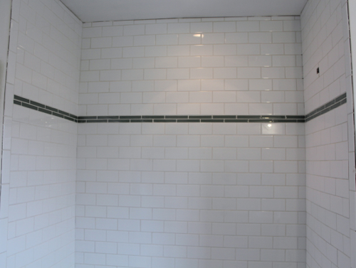
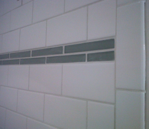
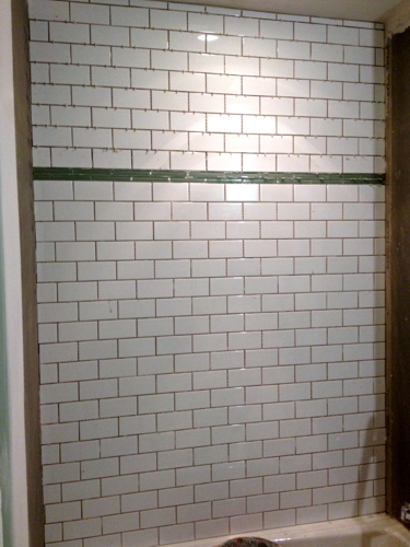
Are you sick of these post titles yet? Yeah, I definitely am which is why I’m so glad that THIS IS THE LAST ONE! Yes, on the 9th day of tiling all of the tile (shower and floor) was grouted. It still needs yet another cleaning but I’m so happy with how it looks. For some reason the glass accent tiles appear darker in the pictures. I’ve actually made several attempts at taking photos of the shower surround and they all ended up making the green glass tiles look drastically darker and bluer then they really are in person. The second photo below is a better representation of their true color, but it’s still a little bit dark.
At any rate, here is the grouted shower surround:

And, here’s the newly grouted floor:
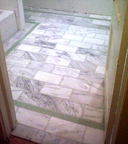
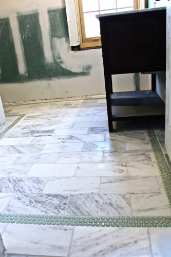
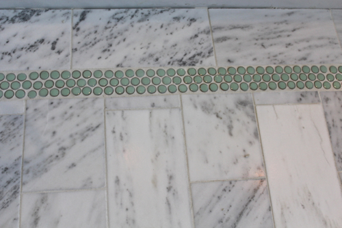
After taking these pictures of the bathroom grouted, I was shocked at how dark the green, glass, accent tiles in the shower appeared in them. So shocked that I actually held this post off another day to go back to the house and make sure the glass tiles didn’t contrast with the penny tiles in the floor as much as the photos made it seem. Admittedly, they are not identical in color but they are definitely not as different as the photos make it seem. For some reason the pictures make the glass tiles look darker and even bluer then they actually are in person. Once installed and grouted, the glass tiles are a little darker then I’d originally thought. However, after revisiting the bathroom today I was relieved to see that they are still the same hue of green as the penny tiles in the floor. Phew, we don’t have to jump right into plan B which was chipping out the glass tiles and replacing them with the same penny tiles that are in the floor. I’m actually thinking this is a good thing because the colors stay within the same spectrum of green and can be tied in together pretty easily with paint.
Speaking of paint, now that Pavlo is moving on to adding trim to the bathroom it’s my time to step in and finalize a paint color for the space. I know I said in my mood board that Sherwin Williams “Sea Salt” would be the color but since paint looks so different up on a wall and in different lighting scenarios, I’m going to pick a few samples before committing.
Here is “Sea Salt” which is a very soft green:
And here is a second color I’m going to test out. It’s called “Conservative Gray” and is also by Sherwin Williams. It is more of a gray (hence the name) with a green undertone. I’m hoping to see if this is a good blend between all of the tile choices (marble, white subway, green glass and the green penny tile).

And here is a third color option called “Agreeable Gray” which actually, despite it’s name, has a brown/beige undertone. My thoughts are that this could possibly be the best because not only could it tie all the tile choices together but it might also pull in the color of the the espresso vanity thus giving a very cohesive look to the bathroom. Will it be too much though? I kind of like how the vanity is a dark, bold statement amongst very bright and clean tile.

Of course I’m hoping that one of these three is THE color. I felt that at the very least these options will tell me what direction to head. Whether the walls should go more green (“Sea Salt”), more gray (“Conservative Gray”) or more brownish/beige (“Agreeable Gray”).
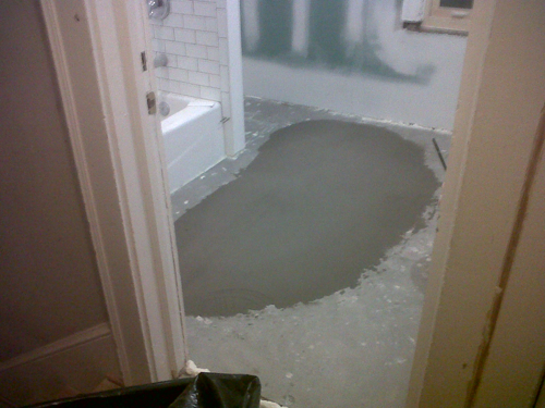
Oh, before I run off, I guess I should address the vanity that, as you can see from the pictures, is already in the bathroom. Yep, even though it was late after a long afternoon of grouting, Pavlo was so thrilled to be completely done with tiling that he moved our new vanity into the space. You can see that it’s been sitting in one of the bedrooms collecting dust for a while but despite that we think it looks very pretty!

gorgeous!!!
Thank you! It’s coming along!